The Walk For Mental Health and Rice Design For America
Role
UX Design Team Lead
Team
3 UX designers
2 design leads
Tools
Figma
Pen and paper
Timeline
6 weeks
1. Identify problem space
a. Client Background
The Walk For Mental Health
A small nonprofit (3 employees) in Houston that aims to destigmatize mental illness by distributing funds to Greater Houston area mental health non-profit agencies.
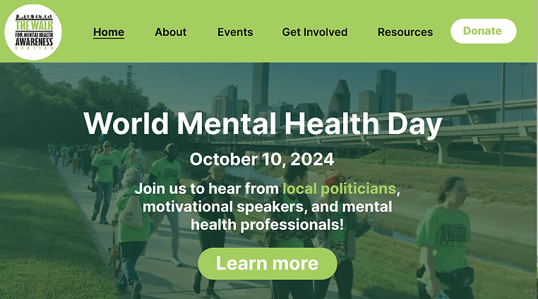
It previously hosted an annual 5k walk but now hosts a World Mental Health Day event to raise funds for mental health nonprofits.

b. Problem Space
The Walk has served Houston for over 20 years, raising over $250,000 for Houston mental health nonprofits.
Yet despite this sucess, the Walk has seen stagnant growth within the size of its organization, event participation, and number of donations.
My Role
As a UX Design Team Lead, I guide my team of 4 UX designers through user research to better understand the root of the Walk's pain points. From there, we will implement a human-centered solution for the Walk that addresses the pain points and our user research insights.
Our team sought to answer: How can we engage both attendees and volunteers at the Walk Houston through increasing digital engagement and implementing rigorous outreach strategies?
2. User research
a. Stakeholder Interview
Users
Houston residents with mental illness and Houston allies of people with mental illness
The Walk's Pain Points
Low internal growth: limited permanent volunteers
Outreach: difficulty reaching users and sponsors
Primary goals
Expand internal operations
Increase event attendance
Increase number of sponsors
b. User Interviews
After attending the Walk's World Mental Health Day and conducting 15 interviews with volunteers and attendees there, we identified user delights and pain points.
.jpg)
My team and I at World Mental Health Day
Delights
-
Volunteers discovered the Walk through purposeful Google search
-
Attendees had personal connections to the Walk's founder
-
Enjoyed hearing from Houston politicians and motivational speakers
Pain points
-
Limited digital presence for the Walk
-
Limited outreach to established mental health communities
c. Analysis of Current Digital Platforms
We noticed that many pain points were related to the Walk's digital platforms. So, we decided to analyze the Walk's website and social media with the users' pain points in mind.
Website pain points
-
Lacked updated event info
-
Complex donation process:
-
Difficult to locate donation page
-
Must print and mail 7 page donation pdf
-
-
Does not increase the Walk's credibility and lacks a consistent, professional brand
-
Sponsors less likely to collaborate
-
In general, the website was not intuitively organized, making it difficult for sponsors, attendees, and donors to learn more about the Walk.
d. Synthesis of Research Insights
Synthesizing our research, we identified 3 core problem spaces.
Digital Presence
-
The Walk's digital platforms are difficult to navigate and lack updated information.
Outreach
-
Users find most of their information about the Walk online.
-
The event lacked "outside" attendees who were not personally connected with the Walk's founder.
-
The Walk faces stagnant growth in terms of sponsorship.
Limited Operations
-
The Walk has only 3 employees:
-
Does not have the capacity for many operations.
-
3. Ideation
a. Solution Ideation
Digital Presence
Outreach
Solution: High-fidelity website redesign prototype
Limited Operations
Since all of these problem spaces are influenced by the Walk's digital presence and operations, my team and I decided to create a high-fidelity Figma redesign of the Walk's website.
We decided this is the most sustainable and feasibly implementable solution we can deliver to the Walk with its limited number of staff and limited resources in mind.
b. Interface Analysis and Feature Ideation
Website pain point
-
Lacked updated event info
Final design
-
Detailed information with engaging photos
Website pain point
-
Complex donation process:
-
Difficult to locate donation page
-
Must print and mail 7 page donation pdf
-
Final design
-
Easy to locate online donation form
-
Familiar interface: similar to donation pages used by well-known nonprofits
Website pain point
-
Does not increase the Walk's credibility and lacks a consistent, professional brand
-
Sponsors less likely to collaborate
-
Final design
-
Stats about the Walk's history and impact to increase credibility
While creating these designs, I emphasized to my team that these designs must make use of the Walk's existing resources and be easy to build and maintain on the developer side.
The Walk is a small organization with limited knowledge on UX design and web development, so it is imperative that our designs are simple to ensure we deliver an impactful, thoughtfully designed product.
4. Testing
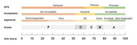
We measured the usability of our prototypes using the industry standard System Usability Score (SUS) as we asked the standardized set of 10 questions to survey our users.
Final design: 87. 5

Our SUS score of 87.5 indicated very high usability!
Our prototype received an excellent usability score, above the 95th percentile. Backed by decades of research, this SUS score identified our product as a promoter of user engagement with excellent usability.
7. Reflection
This project challenged me to approach human-centered design from a different perspective. In the past, as a designer I would focus on creating a design that fits the user's needs but did not carefully consider the context and restraints of the organization I was designing for.
Specifically, because the Walk was a small organization with limited resources, I needed to guide my team towards a design that is user-friendly for both the Walk's users and the Walk's employees who will implement our prototype.
Overall, this challenge allowed me to grow as both a designer and a team leader, and I'm excited to apply this new perspective that I learned from this project in future projects.

